How To Spot Arial
Many of the characters in Helvetica and Arial are very similar to each other, although none are quite identical. Other characters are quite a bit different, and they are the key to telling which is which. Here are some of the most obvious ones (Grotesque 215, Arial’s ancestor, has also been included for comparison):
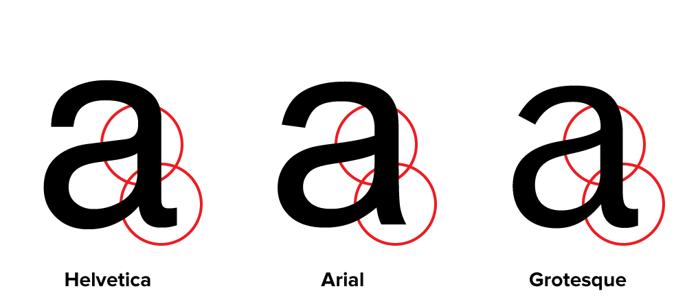
The “a” in Helvetica has a tail; Arial does not. Also, the bowl of the “a” flows into the stem like a backwards “s”; the bowl of Arial’s “a” simply intersects the stem with a slight curve. (Interestingly, the Grotesque “a” has a tail, just like Helvetica. The bolder weights of Helvetica have no tails, an inconsistency that bothers some people. Maybe it bothered Monotype, too.) Arial’s “a” has always seemed a little badly drawn to me, but maybe it’s just me.
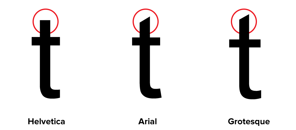
The top of the Arial “t” is cut off at an angle; the Helvetica “t” is cut off straight. You can see clearly here how the x-height of Arial matches Helvetica’s. This is one of the main things that make Arial look like Helvetica at first glance, even though the details are different.
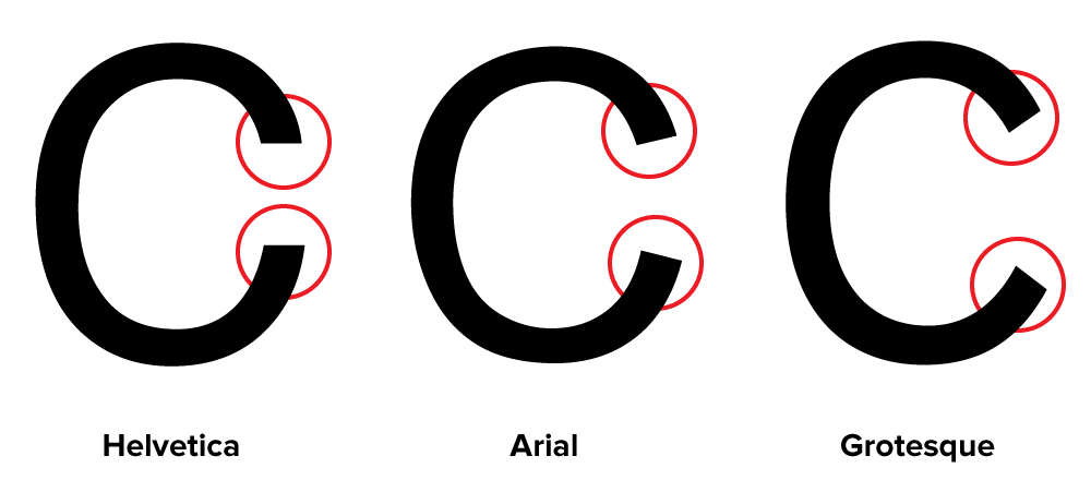
The ends of the strokes of letters like “S” and “C” are perfectly horizontal in Helvetica; in Arial and Grotesque they are cut off at a slight angle.
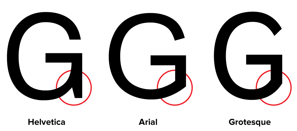
The “G” in Helvetica has a spur at the bottom of the stem on the right side and the curve at the bottom of the “G” flows into the stem; in Arial and Grotesque the “G” has no spur and the curve at the bottom meets the stem at an angle.
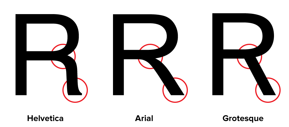
The tail of the “R” in Helvetica flows out from the bowl and curves straight down, ending in a slight curve to the right. In Arial, the tail flows down and to the right from near the center of the horizontal bar and straightens out at an angle to the end. It appears to be a compromise between the Helvetica “R” and the Grotesque “R.” This feature is very unusual for a “grotesque” design, and is more typical of “humanist” sans serifs. It feels out of place here and is one of the more awkward design features of Arial.
Here is the same word set in all three typefaces:


In both fonts, the characteristics described here apply to all weights (except, of course, the tail on the Helvetica “a,” which is dropped on the bolder weights).